

Let’s check in with Bremont. The British brand has been on quite a ride these last few years after an internal shakeup that saw founders Nick and Giles English exit the company, Davide Cerrato take day to day control, and Bill Ackman swoop in with a big investment. We have covered, at some length, the rocky rollout of the first Bremont watches under the new regime and the general public’s reaction to them. That, at this point, is old news. We are well past the stage where we should let the watches speak for themselves without thinking through what each new release means in the larger story that is the evolution of the brand in what is undeniably a completely new direction.
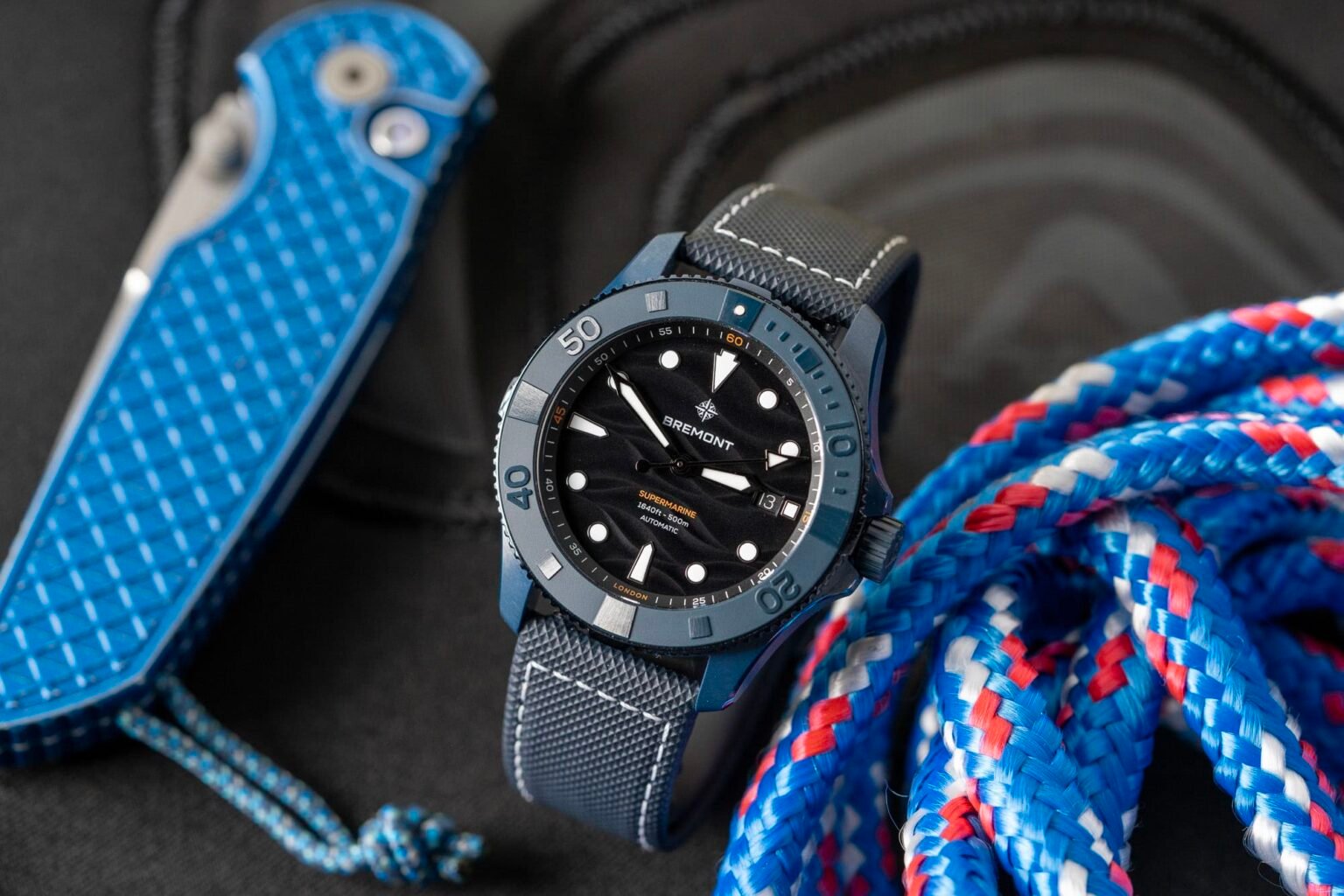
So here we have the new Bremont Supermarine 500 Full Ceramic in Deep Blue. First things first, I love a watch that explains exactly what it is in its own name. It makes my job easier.

Unfortunately, that’s not exactly what we’re working with here. “Full Ceramic” is a bit misleading as the bezel ring and crown are both titanium. The case is ceramic with an inner titanium case protecting the movement. This is a fairly common practice in watchmaking among brands and we shouldn’t necessarily fault Bremont for their case construction here (Tudor and IWC do something similar) but, I don’t know, that “full” in the header is hard to reconcile given the way this watch is made.


If my editor brain is a little hung up on the naming conventions, I hope you’ll forgive me. Most will see this watch on the internet or in a boutique case and understand the broad strokes immediately, and they won’t be wrong. This is Bremont’s big dive watch, rendered in a dark blue ceramic. It has all the trappings of a pro diver including a likely unnecessary 500 meters of water resistance and a helium escape valve on the 9:00 case flank. And in case you were still confused, the dial has a wave pattern, in black. Just like stop signs are red all over the world, a dial with a wave pattern tells us that this watch belongs…with the waves?

The Supermarine has always felt like the oddball collection within Bremont’s larger product line. Back in the pre-wayfinder days, their logo was a plane’s propeller, and the brand really leaned into an aviation aesthetic. But the conventional wisdom that you need a dive watch line is real, and thus we have the Supermarine, which feels somehow apart from the rest of the watches in Bremont’s collection, even now.

Bremont’s aviation focused watches, particularly many of their limited and special editions over the years, always had a real personality and charm to them, even if I have to admit they weren’t necessarily to my personal taste. It was easy to see why so many gravitated toward the brand – the watches were unique and the way the brand was attempting to carve out a definitively British character had a real appeal and felt very thought through. The divers, to me, always felt a little generic by comparison.
And I think the new Supermarine in blue ceramic still suffers in that regard, although I imagine there’s some intentionality on Bremont’s part in creating a dive watch that is engineered to have broad appeal. This is a decidedly less risky endeavor than, for example, any of their new jump hour watches, which I like a lot more but surely have a more niche, enthusiast appeal. The diver isn’t really for the enthusiast. It feels like it’s made for a more casual customer, familiar with what a luxury watch is, but perhaps not yet an owner of one.

The case measures 43mm in diameter and wears large, which is fine, I think, for a watch in this genre. This is not a dive watch that’s playing into the current trend of more medium sized divers, another sign that it’s not really aimed at the enthusiast crowd. It’s 13mm tall, which is actually fairly slim for a watch with 500 meters of water resistance and a helium escape valve. The finishing on the ceramic is actually quite nice and looks and feels premium. The brushing effect is well executed and there are nice transitions between finishing elements on the lugs and case band.
The dial is a glossy black with a deep wave pattern. No points for originality here, but the technical attributes of the dial are hard to fault. The gloss finish of the dial allows the wearer to admire the texture more easily – it tends to really come alive when reflecting light and is not subtle at all.

And here we have a hang up that I often arrive at when writing a watch review. What do I say about a feature or a design element that is nicely done, but that I just don’t care about? Roger Ebert used to say something along the lines of “It’s not what a movie is about, but how it’s about it,” which I always took to mean that as a critic, his job wasn’t to evaluate the subject matter, but how well the filmmakers were able to express whatever ideas they were trying to get across. I think a wave dial in 2026 is kind of hokey and lame and overdone. But this wave dial, objectively speaking, is made with a lot of care I think meant to be very appealing to the obviously many dive watch fans out there who really, really want a wave dial. There’s a lot of (literal) depth here between the wave undulations, the dial has an ability to appear “flat” in certain lighting conditions and like a dramatic topographical map in others, and it all has the gloss of a luxury object. I’d prefer a solid black with no waves at all, but that’s a me problem and not one that Bremont needs to solve.

The watch is powered by the Bremont BE-92AV caliber, which is a modified Sellita SW300 with 56 hours of power reserve, an antimagnetic mainspring and balance wheel, and an Anachron balance spring that is resistant to temperature changes. It is, no doubt, a solid movement. It’s also exactly the kind of movement that will drive people to the comments, absolutely aghast that a brand could charge around $7,200 for something with a movement that is, effectively, “off the shelf.”
I’m generally a defender of watch brands when called out for using a simple movement in an expensive watch. I personally and proudly own a James Lamb watch with a movement that is even more simple than the Sellita used here, and about the same cost. So I’m not here to pile on Bremont for the movement decision here. What I will say is that my James Lamb has a hand made silver case and similarly high craft enamel dial. Bremont is not offering anything remotely similar here – these watches are industrially made (to a very high standard) and are not craft objects.

It will be up to the individual consumer and their taste for ceramic divers as to whether or not the Bremont is worth the $7,000 price tag. There was a time not too long ago when a ceramic sports watch like this was a rarity, but brands like Earthen are producing high quality, colored ceramic watches at a fraction of the cost of watches like this Supermarine. It’s not a one to one comparison, of course, but the barrier to entry to this type of watch is lower than it has ever been, and I think if you want to go for a luxury version of the ceramic sports watch, you have to ask yourself what it’s offering you. That’s true whether the name on the dial is Bremont, IWC, Tudor, or any other large luxury brand. Bremont