
Venezianico makes a lot of watches. This is a fact that’s become unmistakably clear over these last few years as their footprint has expanded in the enthusiast community. Regardless of whether you know them for watches like this or watches like this, there’s a good chance they also make a watch that’s completely unlike anything you’ve already seen from them.
Making a huge variety of watches at a high volume can be a bit of a gamble in this industry. There’s a sense among many enthusiasts that exclusivity is something to be protected, and when a watch brand casts a very wide net, it can dilute their messaging. We had a great discussion along these lines concerning Grand Seiko in a recent podcast. Clearly there was a moment a few years ago when that brand was flooding the market with new stuff, and their identity was a little lost. “Analysis paralysis” is a term often used by consumers to describe the feeling of shopping a brand that has too much stuff to sift through.
The counter argument of course is right there in the Seiko family. No enthusiast would say that too many watches in the Prospex, Presage, and Seiko 5 lines, among others, is a bad thing. Between the many branches of the Seiko family tree, there are accessible options for everyone, and that’s historically been seen as a good thing for the community and the sign of a healthy brand appealing to a broad market.

What this really comes down to is whether a brand is positioning itself as luxury or mass market, and Venezianico finds itself somewhere in the middle, at least at the moment. They have the breadth and variety of a mass market brand, but clearly aspire to luxury. My favorite watches from the brand are the ones in which they embrace opulence. The Utopia linked above with the Italian made movement and guilloche dial, and the Bellanotte I reviewed almost two years ago, are two of my favorite examples. At a recent Windup, a colleague picked up an Arensale with a fully engraved case and bracelet, a watch I didn’t even know they made, that really impressed me.
I’ll point out here that the opulence and luxury that Venezianico trades in is primarily aesthetic. These watches are all pretty accessible, with the Utopia topping out the range at around $5,000. Most of the watches in their catalog, though, sit at around $1,000, which is well below the normal entry point, historically, for luxuries and craft like engraved cases and multi piece stone dials. I imagine the brand is able to achieve these price points primarily by operating at high volumes and sourcing affordable materials from China and other Asian countries, something extremely common in the watch industry but rarely discussed. It’s also rare that brands let consumers in on their own savings in the way Venezianico does.

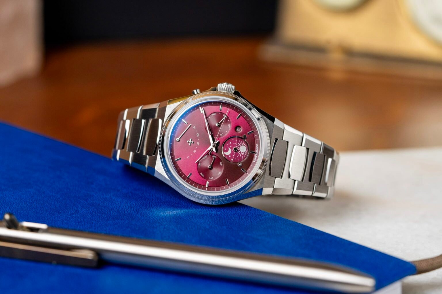
Another way we’re seeing Venezianico reach toward luxury is through complications, which is the right prism through which to view the new Arsenale Calendario. The Calendario is a calendar watch built on the brand’s Arsenale integrated bracelet sports watch platform, and is the latest example of the trend we’ve seen from micro and small indie brands reaching into the depths of the Miyota catalog and adding their own small modifications in the name of variety.
The heart of the watch is the Miyota 9100 complete calendar movement, which features a power reserve indicator at 12:00, day of the week at 9:00, month at 3:00, and a custom day/night indicator at 6:00. There’s also a fairly discreet circular date window at 4:30. The movement is straightforward in its operation: unscrewing the crown allows you to wind the watch in first position, and pulling it out one stop is where you’ll adjust the day of the week (with a counterclockwise rotation) and date (with a clockwise rotation). One more pull of the crown hacks the movement and is where you’ll set the time. Rapid month correction is possible via a small pusher on the case flank near 2:00.

Venezianico is particularly proud of their execution of the day/night indicator, which is represented here with a rotating sun and moon, divided by a crescent shaped piece of sapphire, affixed to the dial with visible screws. This replaces the usual 24 hour indicator that we’d normally see with this movement, and I think it’s a solid choice, even if the end result is something a little less precise. It adds a layer of whimsy to the whole project, and it’s nice that we’re able to see the entire day/night disc thanks to the use of the sapphire divider.
The power reserve indicator at 12:00 is, I think, something of a love it or hate it proposition, or maybe it’s both at the same time. On the one hand, it balances the dial. If Venezianico had elected to not incorporate the 9100’s power reserve, I think it’s likely the negative space in the dial’s upper quadrant would have made the thing feel more than a little off. On the other hand, there’s an argument to be made that a power reserve indicator is not really necessary on an automatic watch. I’m not sure I agree with that sentiment, but I do think on an automatic watch the power reserve indicator should be less prominent than it is here, since the duration of the power reserve isn’t really a complication unto itself like it might be if this were a 6, 7, or 8 day movement (the Miyota 9100 runs for about 40 hours).
The real issue with the dial, though, and the one that makes this watch a tough sell for me, is that the legibility of the calendar indications is really not very good at all. It could be my aging eyesight, but I think typography plays a role here as well. The day of the week and month indicators are printed in a very small typeface with a thin, minimalist style that makes the abbreviations (in Italian) tough to make out. They work a little better, perhaps, if you think of these indicators as a rough visualization of where we are in the week or calendar year relative to the entirety of each, but even then, the hands are short and thin and sometimes get lost on the dial if the light isn’t great.


The stainless case of the Calendario measures 40mm in diameter and 9.6mm tall, not including the crystal, and has 50 meters of water resistance. But the really important spec on any integrated bracelet sports watch is the lug to lug measurement, which on the Calendario comes to about 44mm. This, on paper, is not an unreasonable number, but illustrates the importance of trying watches on and experiencing them, as no set of measurements can fully account for your own individual wrist shape and other factors that go into bracelet construction and bracelet-to-case integration. Because while the lug to lug measurement is technically 44mm, in practical terms it feels like quite a bit more than that as the first link on either end of the bracelet does not fully articulate. This means that the 12:00 and 6:00 sides of the bracelet are effectively extensions of the case and lugs themselves, and I think unless you have a very large wrist you might find the way the Calendario wears to be a bit overbearing.
It’s a little disappointing because on balance I like the shape and appearance of the case. I’ve tried on the other versions of the Arsenale in the past on rubber straps and these tend to wear very well in my experience, but the bracelet execution is just not for me. That said, the bracelet itself, like the case, is nice looking and more complex than you’d expect for a watch that costs $1,400 (time only versions of the Arsenale are even less, and have the same bracelet and case execution). The links are brushed and “H” shaped, and have polished bevels on each side. There are even polished bevels on the center links, which is a really nice touch.

Back to the case, it lands on the more angular end of the spectrum when it comes to integrated bracelet sports watches, which tends to be my preference for watches in this style. It’s a bit asymmetric, with the 9:00 side executed with a gentle curve, but the 3:00 sporting case flanks that appear perfectly straight. Polished bevels on the sides of the case meet the bracelet’s bevels with the same finishing, as you’d expect. The knurled bezel is fine, but I found myself thinking about what it might look like with a fully polished finish instead. Also, it’s barely been a month since Watches & Wonders, and I still have those Parmigiani Fleurier Torics on the brain, and there’s simply no beating the knurled bezels on those (far more expensive, obviously) watches.
The Calendario is available in two dial executions, the deep red seen here, and a bright blue variant. Red is always the most difficult dial color to pull off. I find it to be very appealing in the abstract, but tough to coordinate in real life. It’s just tough to match, and you kind of have to accept that you’re going to power clash with a bright red dial. On the Calendario, this red dial has a nice reflective metallic effect that is a better and more idiosyncratic choice than a typical sunburst finish. The subdials are slightly sunken and textured, which adds visual interest and a nice layered effect.

Both dial executions are sold out of the first two batches released by Venezianico, but a third batch is available for pre-order on their website with an expected delivery timeframe in September (earlier batches are expected to ship in June and August). That feels like a long time to wait, but if this happens to be the sporty complete calendar that speaks to you, I don’t think it’s a bad deal at $1,400. For me personally, it’s missing some of the personality of the Venezianico releases I admire the most, and suffers from some legibility and wearability issues that I wasn’t able to get past. Venezianico


