

Maybe “trend” was always the wrong way to frame the watch industry’s collective obsession with stone dials? I don’t know about you, but I certainly feel like we might have reached a point where the stone dial is essentially just another colorway. Just as brands are expected to offer dials in blue, black, and white, perhaps we’ve reached that point where it should just be expected that they’ll offer an option (or several) in stone as well.
I like the look of a stone dial, but I admit I’m getting quite bored of seeing them invade my inbox on a daily basis. This is the perspective of a guy with a very particular view on all the stone dial action. I’m not a casual observer. I work in the industry and I see, at least to some extent, how the nuts and bolts of the business works, and at the moment brands are simply cashing in on an unprecedented interest in stone (and mother of pearl) dials. Stone dials were never actually “rare” but they felt special before this boom because they were so infrequently used. Access to these dials is now virtually unlimited and, presumably, pretty affordable. So the rush continues, to the point I think where it’s just a static part of our ecosystem.

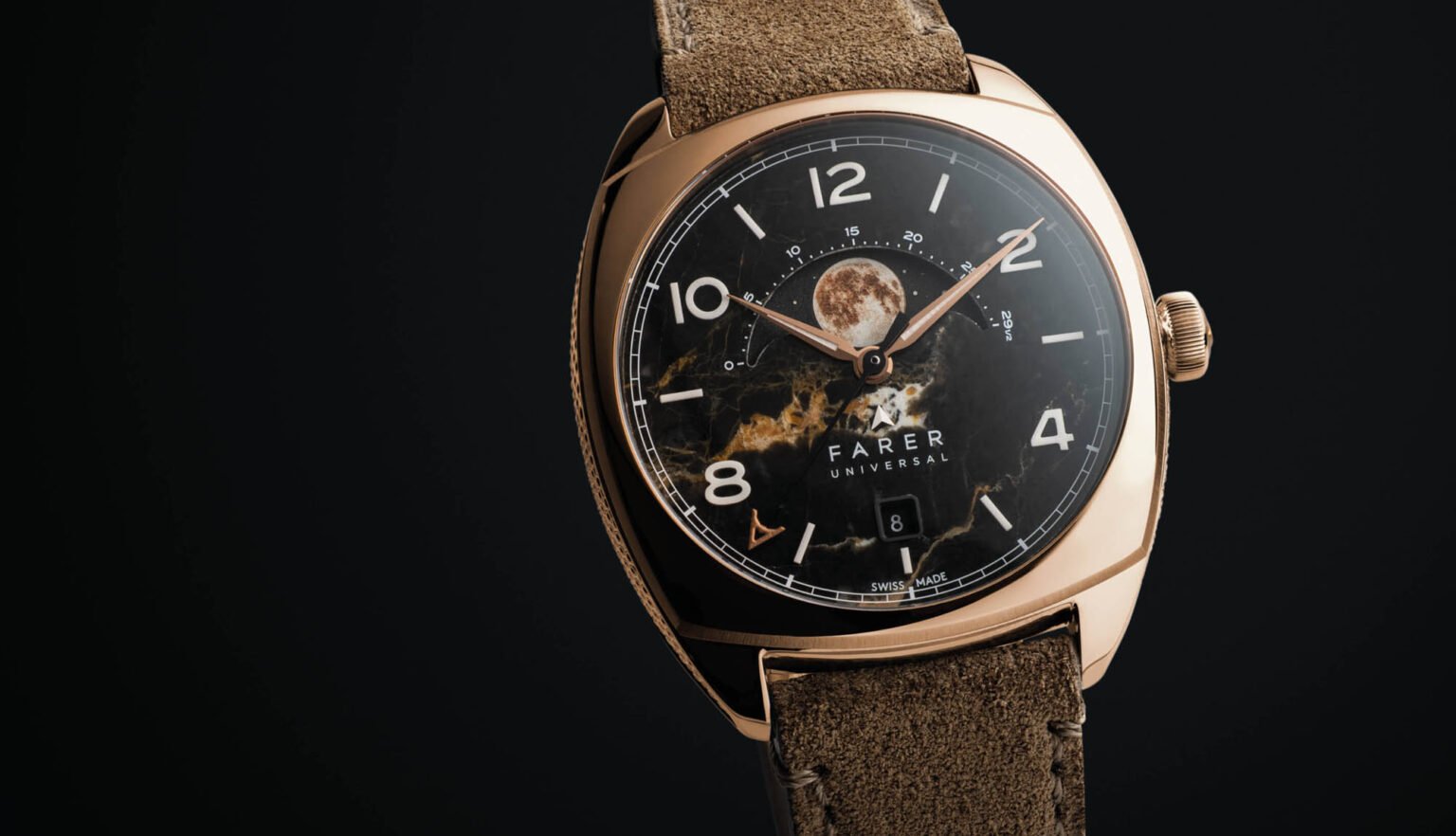
And it’s that environment in which the newest member of the Farer Moonphase collection arrives. This is the Stratton II, the latest edition of what Farer says is their most popular moonphase model.
The centerpiece (literally) of the Stratton II is a new moonphase disc made in Switzerland by the firm AJS Productions. AJS uses a unique process using precision laser etching to create a photorealistic image of the moon for the dial of the Stratton II. According to Farer, multiple layers of paint and Super-LumiNova are etched into the disc, which is just 6mm in diameter.

When it comes to the representation of the moon for a moonphase complication, people tend to have strong preferences. There are basically three ways to depict the moon: an accurate to the eye representation like we see here with the Stratton II, a whimsical take like you’d see with Naoya Hida (think a smiling or winking moon and you get the idea), or a completely abstract moon, where the heavenly body itself is not depicted on the dial (ochs und junior comes to mind here).
Personally, I favor a whimsical take, so I’m not exactly predisposed to a design like this. But I will say that a photorealistic moon makes a ton of sense on this watch thanks to the stone dial being used. Farer is using black Eisenkiessel here, a type of quartz stone with prominent iron compunts that run through the material to give it texture and some drama. The stone takes on a gold-brown hue, which is a great match to the gold tone dial and moonphase disc.

The Stratton II’s cushion case measures 39mm in diameter and 11.8mm thick. It’s relatively short from lug to lug, at 45mm. Water resistance is rated to 50 meters, and the watch runs on the Sellita SW288-1, an Elaboré Grade movement with around 45 hours of power reserve.

As fatigued as I am with the onslaught of new stone dials coming to market, I have to give credit to Farer for at least pulling together a coherent design that doesn’t feel dashed off or slapped together. Even though it’s not to my own specific taste (like I said, give me a smiling, cartoon-like moon, please), it’s abundantly clear that someone took their time in designing this watch, and thought through all of the critical details.
The Farer Stratton II has a retail price of $2,175. Farer