
Earlier this year, Longines started rolling out a refresh of its dressy, polished Master Collection. But while that update was relegated to a large array of time-and-date models, I think today’s new product launch brings something much more noteworthy to the table. There are two main additions: one by way of an update to a classic Longines chronograph, and the other, the first monopusher chronograph designed for the Longines Master Collection.
The Updated Master Collection Chrono Moonphase
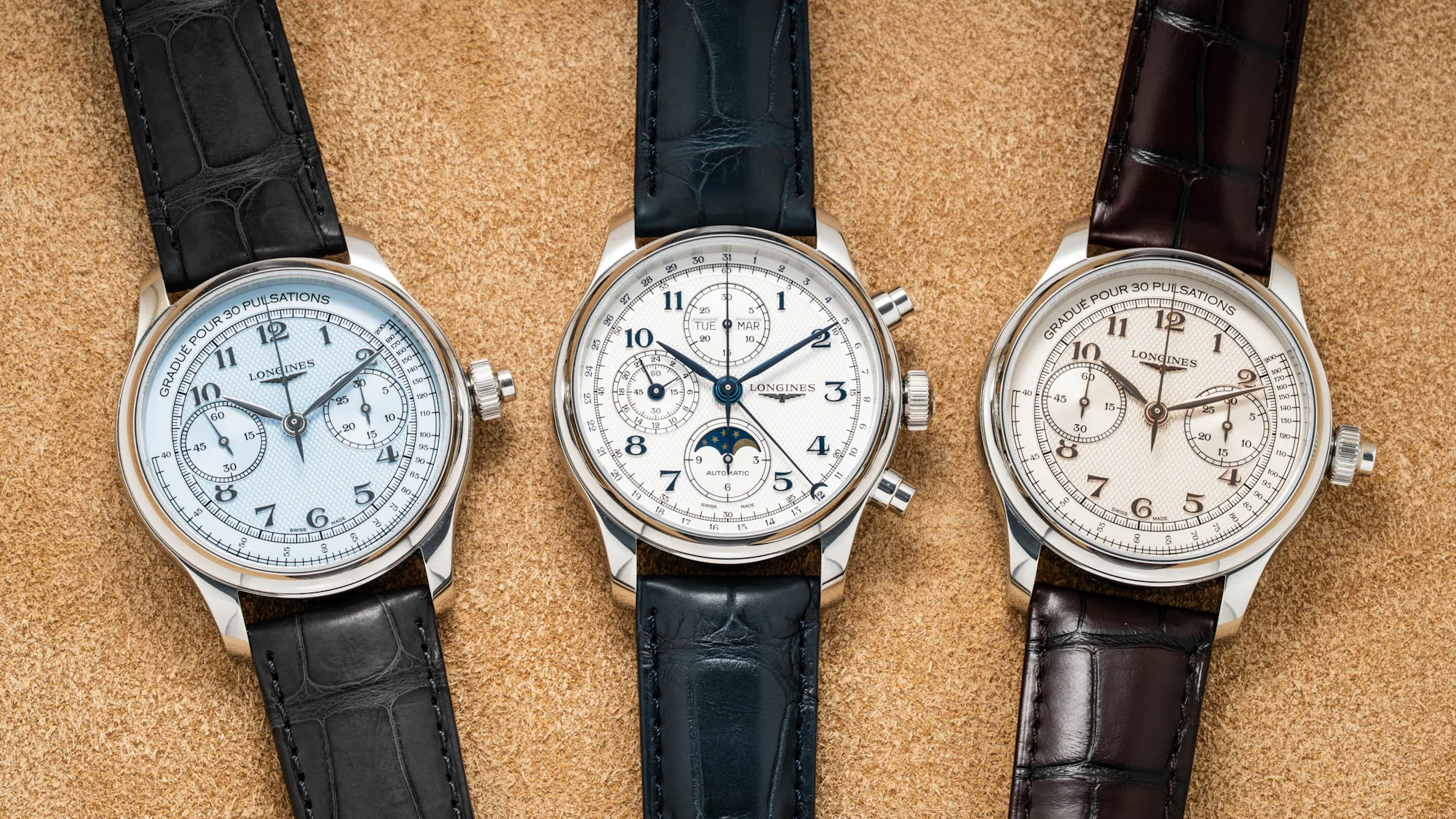
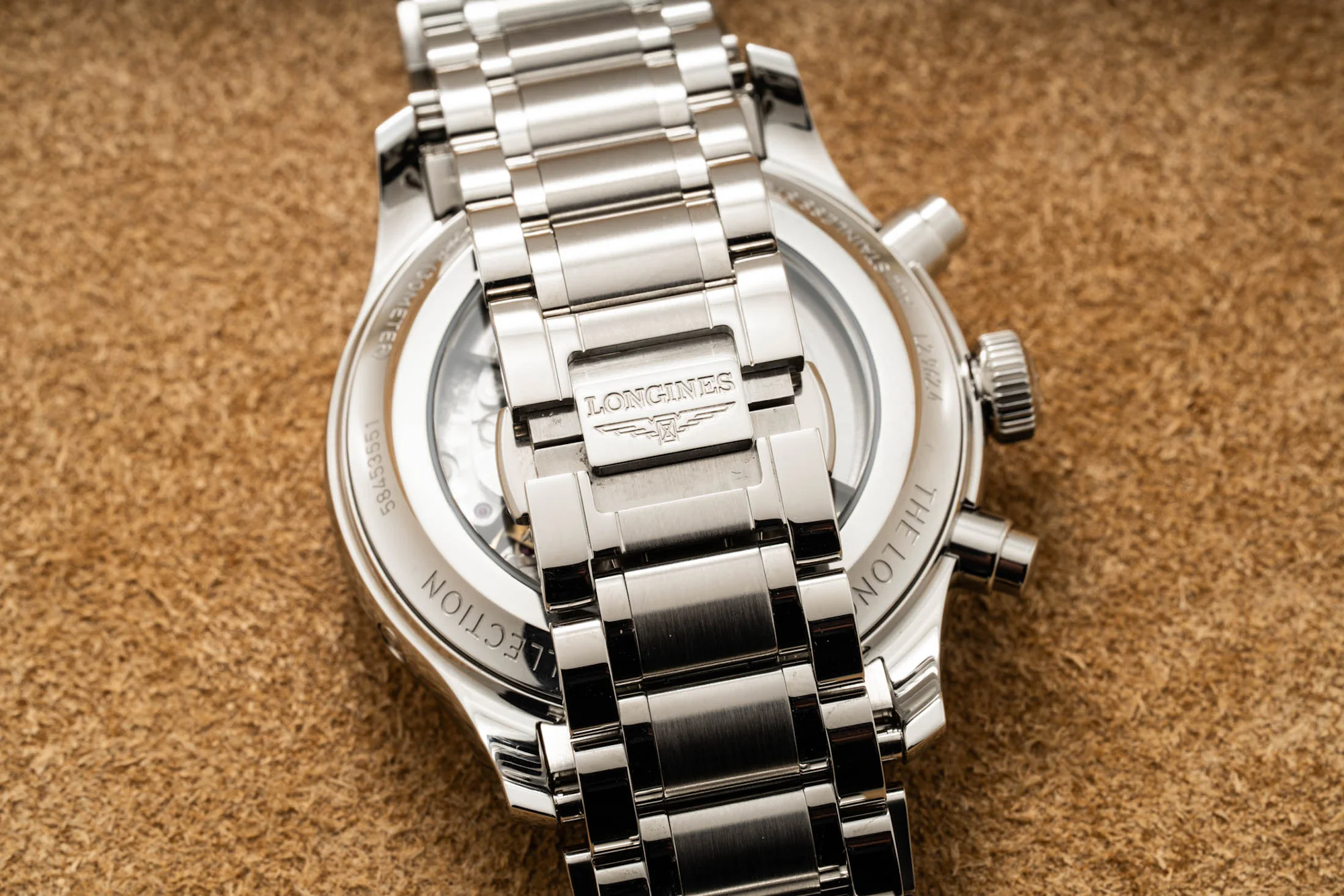
The first is a refresh of the Master Collection Chrono Moonphase, ref. L2.962.4.73.2, largely an aesthetic refinement over the outgoing model. First is the consolidation of two case options, 40mm and 42mm, meeting in the middle at a 41mm diameter for the new generation. The thickness of the stainless steel case measures 13.8 mm (down from 14.2mm), and the lug-to-lug comes in at a large but not oversized 48.6mm. The case silhouette remains largely untouched here, reflecting the soft, fully polished case design with little in the way of contrasting lines or faceting on the exterior, which is exaggerated by the polished concave bezel.
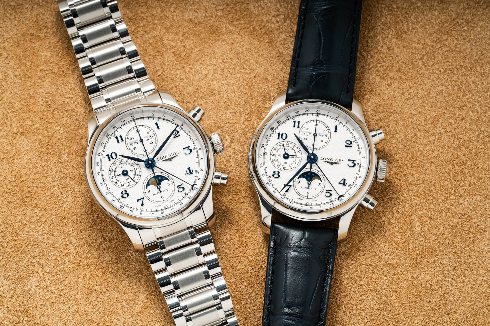

Most of the changes come by way of the dial, which combines a whole slew of small design changes for what is, in my opinion, a significantly improved design. Iterating on the brand’s familiar barleycorn-textured dial, Longines cleans up a lot of the typography for a much more balanced look overall.
It’s essential for what is quite a busy dial, needing to cram in indications for a chronograph, moonphase, triple-calendar with pointer date, and a twenty-four-hour indicator. Gone is the jarring mashup of highly stylized numerals with occasional parts in what appears to be Helvetica. Now, all the numerical elements on the dial feel more cohesive in a standardized system, with only a few bits of sans-serif text in the calendar apertures and the “Swiss Made” and “Automatic” markings on the dial.

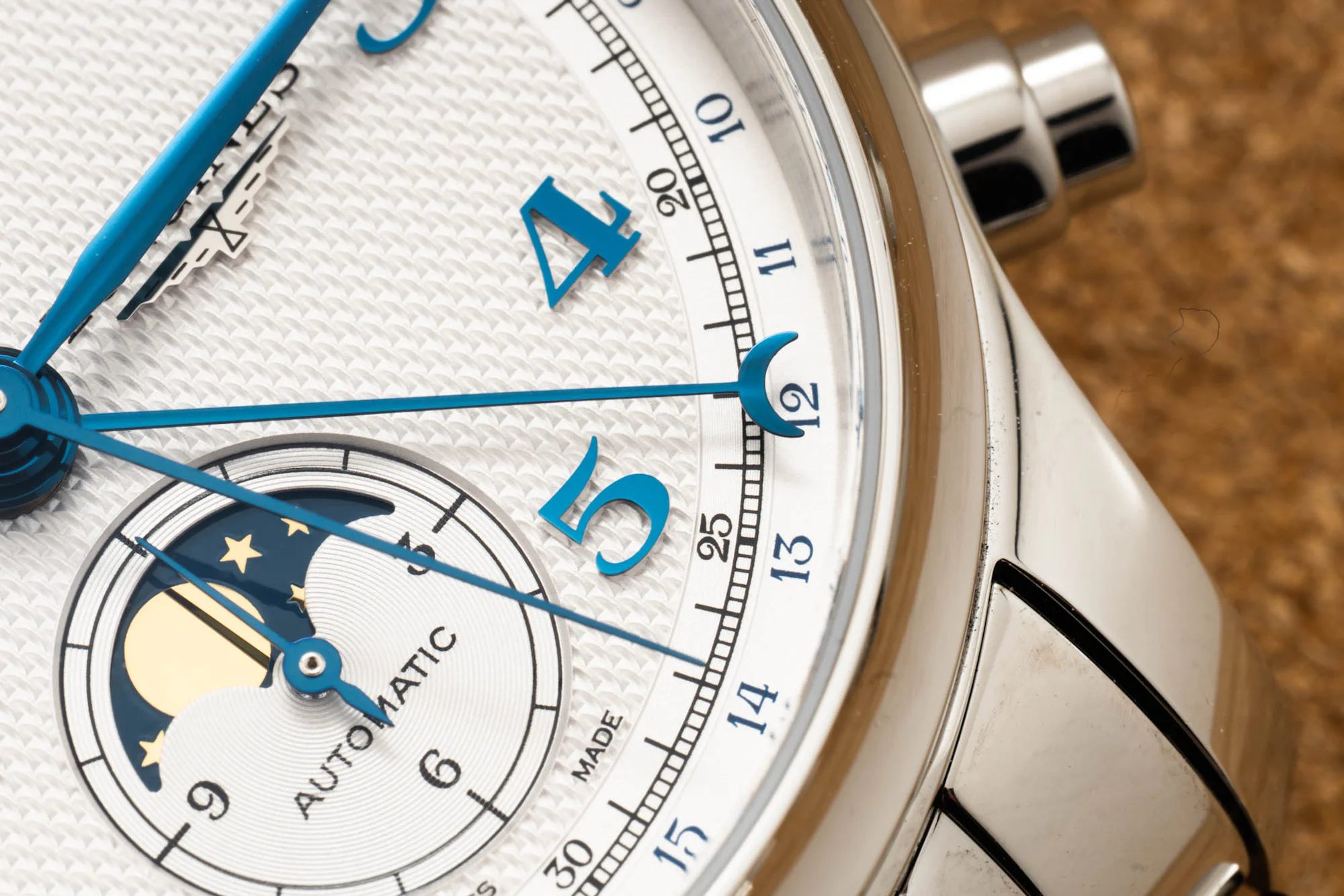
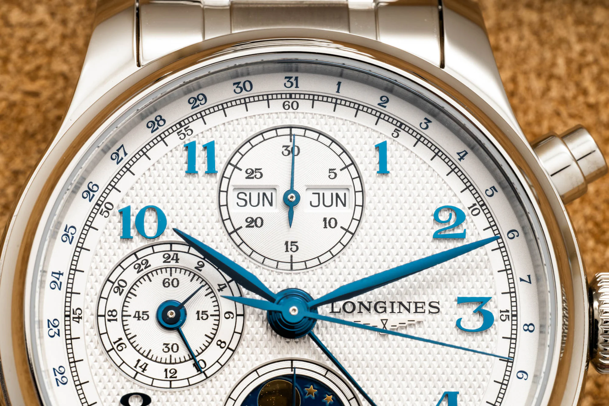
Longines has also removed the sloped rehaut from the outgoing design, opting for a flatter dial look—the numerals for the pointer date are printed on the outermost portion of the chapter ring, while the printed minutes track sits inside, a reversal from the outgoing design. I cannot stress enough how much of an improvement this arrangement is, as the minutes hand on the older generation only extended to the inner date ring, with the minutes track printed on the sloped rehaut around it. Last but certainly not least, this new generation gets applied numerals as well as an applied Longines winged hourglass logo, giving an additional level of depth to the dial with those raised blue numerals. The best part of it all? None of the applied hour numerals are cut off by any of the subdials.
On the wrist, it’s able to catch light in a much better manner as well as improve the legibility of the time, with the numerals and blued handset much more distinguishable from the noise of the other printed text on the dial. Inside the watch is the Longines-exclusive Valjoux-7751-based L687.5 caliber, with a 66-hour power reserve, column wheel, and silicon balance spring—solid specs, but the same as in the prior generation. The new design is available on either a bracelet or alligator leather strap, but I think the bracelet is a no-brainer, especially as both are priced the same at $4,250. Both the bracelet and the clasp for the leather strap feature tool-less micro-adjustment.
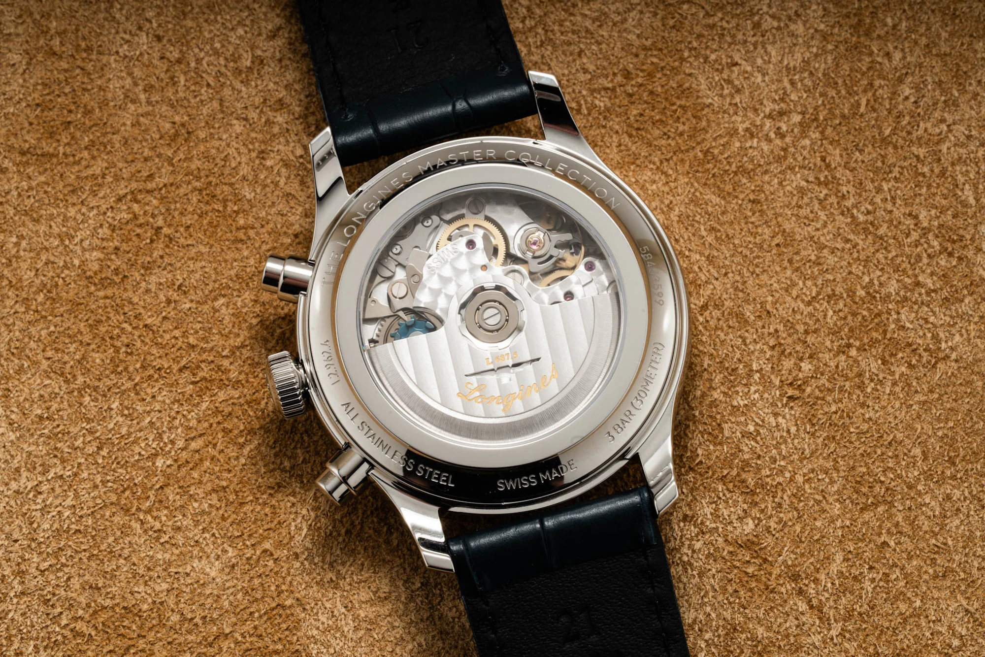
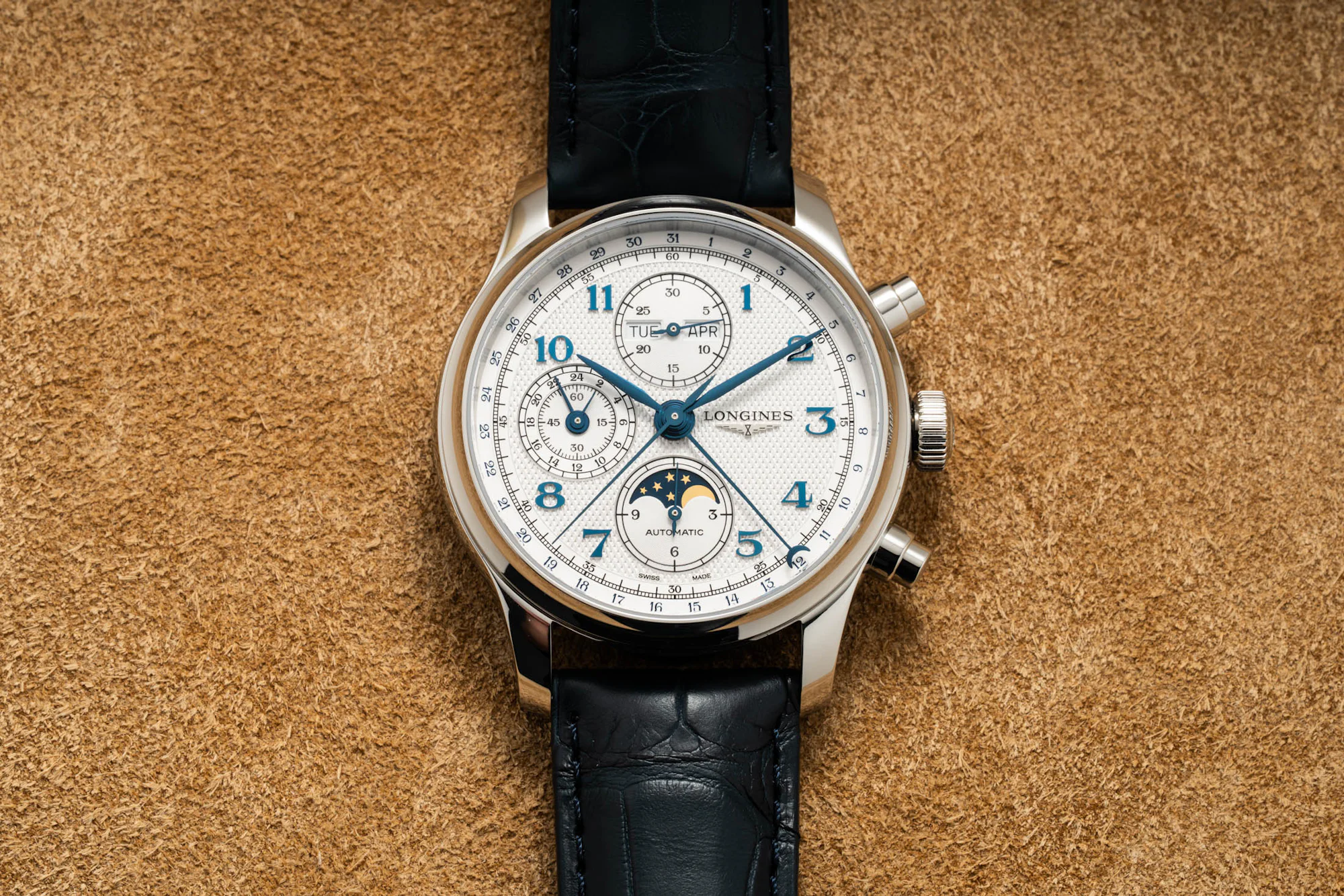

This calendar chronograph with moonphase, in a familiar Valjoux chronograph dial layout, has been such an emblematic part of the Longines catalog for so many years. And yet it never really seems to be the watch the brand recommends within enthusiast circles. I think the older dial design did a lot to hold back this model, and yes, it is still a very specific aesthetic that pairs dress-watch aesthetic cues with a chunky profile and a bunch of complications. But as far as subtle evolutions go, the dial of the new generation marks a great improvement over the outgoing model.
The New Master Collection Chrono Monopusher
While the Chrono Moonphase marked an update to a long-standing model, I’m sure most of you are reading this for the new monopusher chronographs revealed today. It has been a while since we’ve seen Longines release a monopusher chronograph for the modern collection—six years since the Avigation Watch Type A-7 1935, an homage to the brand’s rather distinct slanted early-twentieth-century pocket watch chronograph conversion for pilots. This kind of product gap feels especially wrong for Longines, a brand known for making some of the earliest monopusher chronographs in the history of wristwatches.


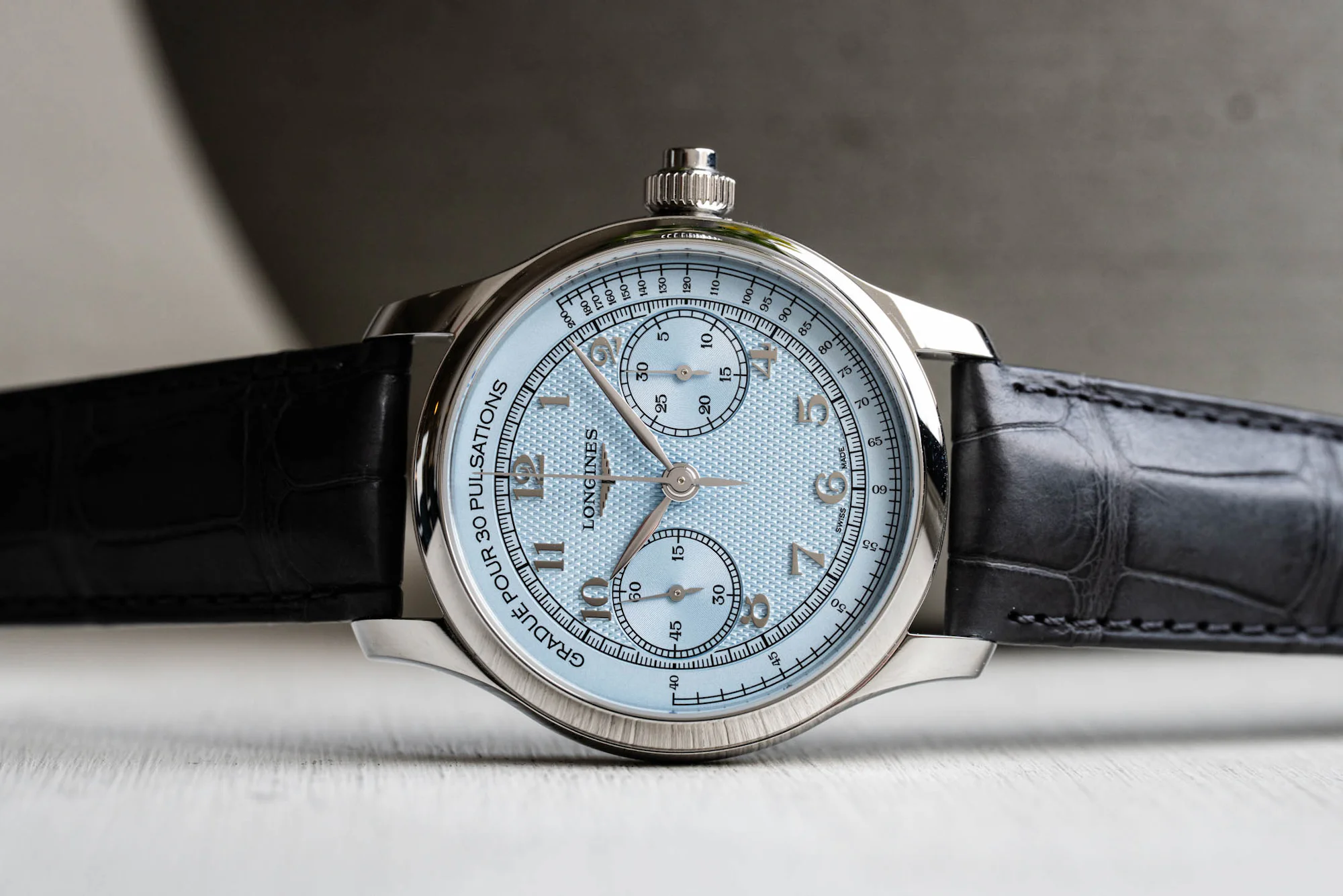
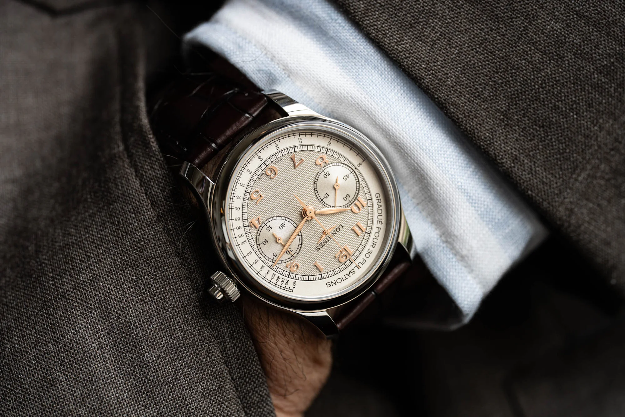
Thankfully, the monopusher is finally back in the Longines catalog, taking cues from the Master Collection line’s aesthetic—the rounded, fully polished case, concave bezel, and a stamped barleycorn guilloché design, to name a few. There are two dial colors, one in a frosted blue hue (ref. L2.960.4.93.2) and the other in a warm silver opaline (ref. L2.960.4.78.2). Both are set in a 41mm stainless steel case, with a thickness of 12.6mm and a lug-to-lug of 48.6mm.
This means that both the Chrono Monopusher references and the Chrono Moonphase models share the same case diameter and lug-to-lug, with the only difference being the thickness. It’s a unified look for this part of the collection’s refresh, but if there’s anything we’ve learned from other Longines models like the Hydroconquest and the Legend Diver, I’m sure we’ll see a smaller option become available down the line.
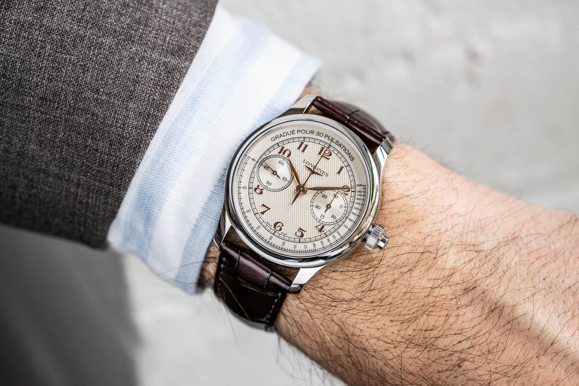
On both the frosted blue and the silver opaline dial finishes, applied numerals match the tone of the handset—5N plated rose gold for the silver opaline dial, and rhodium-plated for the light blue dial—as they sit on the barleycorn-textured portion of the dial. Unlike the Chrono Moonphase, however, the 2, 4, 8, and 10 numerals are partially cut off by the two snailed subdials. The decision to leave out a date window is a great touch.
The inclusion of a pulsation scale on the chronographs feels like a nice touch for the watch nerds, replacing the more conventional tachymeter scale. While a nice reference, the scale takes up a rather large amount of space relative to the rest of the dial. Yes, a larger pulsation scale makes the chronograph seconds easier to read, but the resulting negative space around the main dial feels a bit empty. You could argue that historically, however, many pulsometers on vintage chronographs also share a similar visual trait. But those watches were far smaller in size, and once you’re in 41mm territory, it feels more noticeable. It’s a strong case for a future, smaller-cased design that might alleviate this issue, even if the scale would then need to be reworked.


It’s easier for me to be this nitpicky on the dial because there’s not much else from my side to complain about with the execution here. In person, the dial is quite attractive thanks to the cohesive typography between the printed scale and subdial markings, and I always find applied numerals to be a plus when it comes to making a dial feel just a bit more premium in its look. Up close, there’s also just a tad bit of layering with the dial elements, with the ring of the pulsometer scale ever so slightly stepped up from the railroad minutes track, which is then stepped up from the slightly sunken-in subdials. It’s not dramatic, but paired with the barleycorn guilloché middle, there are enough textures and layers to hold your attention without feeling overwhelming.
On the wrist, I find that these monopushers are incredibly good-looking in their more classic sensibility. The 41mm case, while certainly not small in size and optically large due to the fully polished surface, still feels manageable even on my smaller wrist thanks to the shorter lug design. Please, though, Longines—can I see a black dial variant soon? Between the ultra-cold shade of the frosted blue dial and the warm tones of the silver opaline dial, I think there are many out there who would love to see a dial option that sits in between.
On the right side of the case, interrupting the rounded, polished midcase is the oversized crown with a monopusher integrated in the center of it. It operates the new ETA-built, Longines-exclusive manual-winding monopusher L799.5 caliber, which features many of the specs familiar to a modern Longines chronograph caliber—a column wheel, a silicon balance spring, and a 68-hour power reserve while running at 28,800 VpH.


Priced at $3,900 on an alligator leather strap (no bracelet for the monopusher, sadly), the new models are very well-priced for the amount of watch you are getting. You may find some microbrand monopusher chronograph offerings for less, but you’re typically expecting a cam-operated SW510 for those, and even some of the SW510-powered monopushers out there are priced similarly to this, if not even higher.
And if we compare it to the $3,450 price tag of the 2020 Longines Avigation Watch Type A-7 1935 monopusher, the price increase after six years for what is a significantly more complex dial and better-specced caliber feels surprisingly minimal. As such, the Master Collection Chrono Monopusher certainly deserves the title of value proposition within the brand’s assortment, and is a welcome new addition to the sparse field of mechanical monopusher chronographs out there.
For more, visit Longines.